New things in cartons
We’re still mulling over the exclusive design/logo for “Heroes” in the fundraising campaign, but we were so pleased with this when we came up with it this morning that we thought it was too good to limit to people with lots of money.
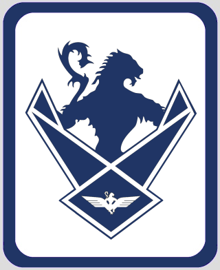
It’s also the first Megastore sub-section with the new version of our masthead logo, designed to show progress from 2012 to 2013. (Last year we’d just found our old wings in the attic, now we’ve well and truly got them on. Not sure what we’re going to do for 2014 yet, maybe patch up all the holes.)
We might do a special version or exclusive colour run for Heroes or something, or come up with something different entirely. For now, click the image to see the product range, or just simply look at it and bask in our genius 😉


Well why not go with “Local Hero”.
Seems apt
Very clever Rev.
Would an exclamation mark at the end of ‘ourselves’ enhance it?
Is there any merchandise with the logo, but without the quips?
Bit close to Sinn Fhein – we ourselves?
I like it. I don’t actually like the new version of your masthead logo so much , but no doubt I’ll get used to it.
I’m constantly debating with myself just how suibtle it has to get before a sweatshirt will get past my employer’s ban on wearing sporting or political logos. This one – maybe not so much.
Hey Morag did you happen to see my offer to you on the ‘8 days’ post?
“Is there any merchandise with the logo, but without the quips?”
I could certainly knock some up in a few minutes if there’s a demand for it. No words at all?
Yep, no words. My screen show dollar prices for shop? P.S. Liked McNeil’s piece in the Herald today.
Like it. Good wordplay!
Ahh, I hadn’t noticed the subtle change to the logo – when did that happen?
As a Hero, I would be quite happy to just have “HERO” automatically appear under my Gravatar, or something similar to fuel my ego. Although an empty display case with “Positive Case For The Union in here” in diamond-encrusted letters would suffice.
Keef said:
Hey Morag did you happen to see my offer to you on the ’8 days’ post?
Yes, I did. Already done the Hero bit, and holding off now till it gets nearer the target date. I still think you should take him out though. I don’t know who isn’t there, but I suggested Macbeth and/or Kenneth MacAlpine, neither of whom I saw on a quick run-through.
I don’t remember if Queen Margaret was there, but I hope not. Including token women shouldn’t extend to the woman who brought to an end the Scottish royal house speaking Gaelic, and tried to get everything as Anglicised as possible.
I really like the logo with the patchy wings, don’t ever fill them in! It would make a great tattoo, but I’d better not: while we all want indepedenece it only goes so far when you have a partner.
Maybe it’s just me, for some reason the clean solid font doesn’t ‘feel’ right with the patchy wings. I’d love to see the logo with some simple shading to give it a little depth – Nothing too fancy like, the fact that it’s simple without too much going on but still manages to look cool is what makes it a winner in my opinion.
“Maybe it’s just me, for some reason the clean solid font doesn’t ’feel’ right with the patchy wings.”
I should be able to locate some more beaten-up fonts, will have a muck around in Paint Shop later and see what happens.
Mit Flügeln, die ich mir errungen, werde ich entschweben …. 🙂
Never let it be said we’re slack on customer service.
Plain-logo products (2012 version):
link to cafepress.com
2013 version:
link to cafepress.com
(Oh, and the currency selector should be at top-right.)
Wow, a very speedy response! Cheers!
Looking for the Scottish Pound option. Coming soon!
Sorry but I think the text BETTER OURSELVES just doesn’t fit.
It’s much too near to the bitter together slogan – better this -better that – better yourself – better ourselves – better future – better nation – better ……. etc. We’re not good enough, we need to get better. It’s not positive and forward looking.
I thnk we need something with more power, a definition of stronger together, dynamic.
Thinking cap switched on …?
It’s an extremely clever pun, but I agree there will be people who don’t get it.
“Thinking cap switched on …?”
They do electric thinking caps now?
I agree it needs an exclamation mark – not strident enough. Maybe stick an Alba gu snooker loopy! on there too.
I’m a journalist. Nothing is EVER improved by an exclamation mark, except ironically.
“It’s much too near to the bitter together slogan”
That’s kind of the point.
@midgehunter
That’s quite a good point, actually.
@Re
That’s quite a good point as well. Not sure what to make of it now.
I think it’s a witty play on words, but the separation (sorry) of the two words made it harder for me to notice that play on words.
@Rev
I could certainly knock some up in a few minutes
Will you behave yourself!
Someone should do BetterOurselves posters etc in the BetterTogether font…
Yeah, that’s a good idea. I was thinking the best place for that slogan was at a Bitter Together meeting! Could confuse the poor dears something rotten.
I’ve never liked the logo. I think it looks too militaristic and threatening, like the battle-worn banner of a conquering legion. It squats above us and spreads its wings in an aggressive display. Some may see it as a representation of imperialism in tatters, but that’s not the immediate message that it conveys to me. I look at it and old associations colour my response.
I don’t see anything in it that conveys a message of hope and peaceful progress towards a better life in a better world. I’d prefer something clean, modern and bright, conveying an immediate sense of forward, upward, unlimited movement.
Stereotypes! Whit c’n ye dae? 🙂
“I don’t see anything in it that conveys a message of hope and peaceful progress towards a better life in a better world. I’d prefer something clean, modern and bright, conveying an immediate sense of forward, upward, unlimited movement.”
You’ve got our email address, right?
😉
@Rev Stu:
‘I should be able to locate some more beaten-up fonts, will have a muck around in Paint Shop later and see what happens’.
Suggestion – what about the ‘stencil’ style Banksy uses – chunky, urban, edgy…might be a good match for the distressed wings, and aspiring Banksies would find it easy to emulate…not that I’m advocating graffiti of any kind.
“You’ve got our email address, right?”
Aye, Stu. Whitmalike? 🙂
I kinda concur with Albamac, can I have your email address as well please?
Maybe you need to stop being modest and get the product to promote the site?
‘Scotland has Wings”
with URL of course…
Variant magazine did a belter years ago – it was a poster of the 1919 (??) demo in George Square, a monochrome close-up of the massed bunnets with cops helmets dotted amongst them, and a very small slogan, appeared very rough, as if made with one of those John Bull kits. It said ‘Dream At The Top Of Your Voice’. Don’t know who said it originally, but it was a powerful image.
In response to the ‘Scotland is extinguished’ advice, how about:
Scotland- Relight the Flame.
BEST TOGETHER
INDY + UNIONS
or
INDY + UNIONS
BEST TOGETHER
geddit?
A bit too 3rd reich for my tastes, though BETTER OURSELVES is good