Brand re-imagining
Posted on
January 02, 2014 by
Rev. Stuart Campbell
Okay, readers, it’s time to speak your brains. We’ve been evolving the synergy of the Wings customer-facing recognition interface in line with the leading edge of the zeitgeist over the years, from our early crude banners through to the current clean and eye-catching style, and it’s time to pick the logo that’ll take us through 2014.
Give us your thoughts, whydoncha?
2011 #1

2011 #2

2012 #1

2012 #2

2013

2014

Click any pic to biggify. Which is your favourite, folks?


2011#2
I like 2012 #2.
And ’embiggen’, surely.
2011.2
classy understated moody tellsitasitis
2011 #2 or 2012#2
2011#2 unquestionably.
2011 #2
I’ll probably get banned for not stating a favourite but I don’t think all that much of any of them.
2011 #2… this is looking unanimous so far 🙂
Which one OUT OF THE 2014 OPTIONS, you great muppets.
…Ach Pedro… you just spoiled my post. Lol
I like 2011#2
Is this a game of spot the difference stu?
2011#2
It just stands out better imho
love the last cleaner crisper etc, why x3?
I would stay with 2013.
Is 2014 a spot the difference competition?.
Oops have i writ right?
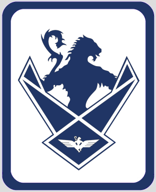
2014 #3 – the lines of the wings should be as clean and straight as possible, as that’s the current look for websites. Basically, it’s the closest to a Windows 8 style logo, and there’s no point pretending that the style of the day for websites doesn’t always follow the style of the current incarnation of Windows.
agreed can’t tell the diff.
2011#1 is my personal favourite…
OMG they are breeding
Second of 2014’s looks best to me. If you’re gong to go for a far more angular approach as in 2014.3 you might as well do it with the top of the wings too and make them regular and the same size all the way across the top.
Of course combining the second of 2014’s with 2012.2 might be the best idea.
BTW RevStu could you please check why my post in last thread was moderated as I don’t want to repeat the error that caused the moderation.
“BTW RevStu could you please check why my post in last thread was moderated as I don’t want to repeat the error that caused the moderation.”
You somehow inserted a rogue CITE tag at the end. The worst of ALL the crimes.
2014 #1
Very subtle differences in the wings… ok. #2
#3 looks too imperalist for my tastes… a little curve up in the wings looks softer and more positive.
“2014 #3 – the lines of the wings should be as clean and straight as possible, as that’s the current look for websites”
Late addition: 2014 #4. Does it change your view?
2011 #2
2011#2 too. i think most welcoming and self-explanatory for all the brand-new visitors/readers who are going to come knocking/clicking in the next 9 months.
BTW Happy New Year Stuart and all the Wings crowd – power to to all your typing and clicking fingers in 2014! It is said the it was the banda printing machine and early photocopiers that did more to bring down the east-european ‘Iron Curtain’ than all of NATO’s military machiney – in the same way it will be keyboarders on Wings and Twitter that will do more than official/formal channels to undermine the pro-Union media/propaganda machinery – which is the ONLY thing that will stop Yes from winning easily…
maybe because I have spent all this year looking at the site, I like the 2013 logo as it has a familiar look and feel. I also have a nice wee badge to match it from the YES rally last year (feels funny saying that now on day 2 of 2014)
“I like the 2013 logo as it has a familiar look and feel. I also have a nice wee badge to match it from the YES rally last year”
Yeah, but when we change the logo for 2014, the 2013 badges will become even more exclusive and collectable 🙂
Actually, now that you’ve sneakily added in a fourth option, I would maybe go for #4.
Definitely have the edge of the feathers in a straight line.
iain in all honesty i cannot tell the difference… I wait to be corrected (right amount i hope)
“Late addition: 2014 #4. Does it change your view?”
That’ll be a “the word of 2014” then 😛
Aha – time for corporate re-branding !
I do like 2011 #2 as well, perhaps with the Soaring above Scottish Politics message replacing the ‘monitoring…’ one.
If I’ve to choose from the 2014 ones, I’ll go for the top one – differentiated as far as I can see by the nicely shaped wings, and the extra hair at the back of the neck.
“You somehow inserted a rogue CITE tag at the end. The worst of ALL the crimes.”
I did?? Don’t know how but I’ll certainly try to avoid doing it again. Thanks.
Ok get it a two degree shift on feathers, tell i am not a graphic designer!
or I suppose 2014 #2 if you absolutely must..
Ok, if it has to be one of the 2014 options, I’d say the first one, but I’ll be honest and say I’ve never really taken to that logo. Both 2011 options look far better than any of the others to me.
The differences are indeed subtle. They’re mostly to do with the “wingtips”, and – as Doug so alertly noticed – whether the “feathers” have curved or straight edges.
the latter two are the best, in my humble (and unobservent) opinion, like the streight edges.
I think either #3 or #4 would be fine- definitely prefer the cleaner lines over the first couple.
This would be easier with a poll surely? (Now that we know what the differences are.)
“This would be easier with a poll surely?”
It’s purely a consultative exercise, not a binding referendum 😉
“Basically, it’s the closest to a Windows 8 style logo, and there’s no point pretending that the style of the day for websites doesn’t always follow the style of the current incarnation of Windows.”
Myself I blame that hideous redesign of the xbox dashboard from ages ago. For that was truly the greatest of ALL crimes. 😉
2011 1 is my favourite. I love seeing the Saltire in the sky any time I’m down south 🙂
And is there a way of downloading the logo so I can have it as my FB avatar? If there is can it be explained in easy to understand lingo please?
2011 number 2
2011 #2
All the 2014 ones look like a monkey falling down a plughole.
Would make a great badge for a car; Ecuire Ecosse could use it!
2014 #2 – The wings demonstrate the current modern aircraft wing design. One sweeping piece of wing with the tips rising instead of the old style winglets.
Actually on reflection, #3 grabs me more.
2014 #3 – clean, sharp, simple. #4 is just a wee bit overdone.
Has to be #2. aspirations to live up to.
2014 number 2 as it has curves which are friendlier
But I think using the official saltire blue would be better than the dark blue that is used in the designs. (hex #0065BD)
Should “Over” not have a lowercase letter?
Crowd fund a formula one team, how fun would that be! Next project after indy!
I choose 2013, it’s already brand recognised, don’t go all ‘new coke’ on us Rev 😉
Anyway, 2014 looks like it should be on a bonnet of a car. i think the current one with the rough edges symbolises our landscape and strength of the people, you know, like granite.
Yeah, I’m thinking #3 again now. Hmmm.
I thought the 2014 style would be the lion wearing the wings more like a guardian angel, rather than still just holding them in its hands?
I confess I still like the 2013 – the ragged tears and holes in the wings suggest that BT have been blasting away with shotguns to bring you down – but have failed. The 2014 bunch send a horribly mid-1930s ubermensch message. I think Mussolini would have loved them.
Then there were four! You takin’ the piss oot us auld yins, Stu?
Anyway, I’ll stick with the first of the four. Straight feathers are for the birds! Oh, no, wait a minute…
2014 #4 or 2011 #1
Happy New Independence Year a’body!
Have tae say, I quite like the original, wi’ the Saltire in the heavens…
Slainté…
dcan, how much do you think car companies spend to get that look, clean hard and sharp, i like steel, nothing against granite apart from the radon.
#2 for me, I like curves 🙂
Three is the magic number
I`m easy. 2014 #4
Though I still have a soft spot for the Lewis Chessman style of 2012, I’ll vote for 2014 #4
“the Lewis Chessman style of 2012”
Actually it’s detail from the commemorative plaque at Athelstaneford, supposed birthplace of the Saltire.
link to educationscotland.gov.uk
Has to be the straight lines of 3 for me full stop thingy 🙂
Hmmmmm…..not sure I like any of the 2014 ones Rev – they all look a bit clinical, blocky and car badgy. The 2013 and 2012/2 are more rustic and rugged; definately more up my street.
Dear Editor,
I chose 2011#2 because it contains the statement of what you actually do to great effect!
‘Monitoring the Scottish Political Media!’
Such a site and such a function has never been more needed. This link was directly below a scathing comment by me on BBC ‘Scotland’ perpetrating an abuse of Democracy on a Daily basis! I worry that the population, despite all of our efforts, are not sufficiently aware of this abuse.
Thank you for your work over 2013, and I wish you a happy and successful New Year. Chas. Kearney.
What we need to do is to have a poll.Then use each one for an appropriate number of days to reflect its popularity.Or we could do we need to do it on a PR system?
@Memphisto: But I think using the official saltire blue would be better than the dark blue that is used in the designs. (hex #0065BD)
I really, really hate the whole debate which resulted in Pantone 300 personally: founded on complete misrepresentation of history and silly personal preferences (also because Reid’s a giant idiot). Pantone 279 or TPX 17-4037 are preferable to me.
“I think using the official saltire blue would be better”
I hate Pantone 300. Pale blue and white is always a hideous combination. The Saltire is about as good as it ever looks on anything, but I still like the darker version much better. Interestingly, at the indy rally I’d say the vast majority of Saltires were the darker blue version. The people’s choice 🙂
Ok you sold me on the exclusivity angle. Put me down for no3 of the 2014 version.
Upcurled wing-tips for me, please. 2014#1. Less militaristic IMHO.
Or use all of them, changing them over the months.
Straight feathers – golden eagle – osprey. Irestmyspace.
Greeting. 2014 #3 Rev.
2011 number 2 for me but I think that the contrails need to be a bit more central and the image to be brighter, particularly on the right hand side.
Also, I don’t think that the over should be capitalised while soaring should be.
I’m with Shady Lady on the 2014 versions.
2011 #1 with the Soaring above Scottish Politics strapline added. The winged rat has never impressed. .
2014 number 4. Clean and crisp and also reminds me of Barney Bubbles designs for Hawkwind. Which is a very good thing. As someone who has low vision I appreciate clear designs.
2014#3.
Agree with the 2011 #2, it looks the nicest, and I like the monitoring the media tagline, it makes it more obvious to new visitors what the site is about.
On the other hand I think one of the 2013/14 are more practical and probably work better if you are posting links on some sites (like facebook) and you get the logo as a thumbnail, the simpler, cleaner lines work much better in these circumstances.
20111#1 for me Stu
I give up.
link to encrypted-tbn1.gstatic.com
I mean, the logo’s great and everything but it just looks a tiny bit Waffen S.S. to me…
“I mean, the logo’s great and everything but it just looks a tiny bit Waffen S.S. to me…”
Um, the Waffen SS logo was a skull and crossbones…
link to ioffer.com
Out of the 2014 options I like #4 with the upturned wingtips. I think I still prefer the printed/stamped style of the 2013 logo though. It has more character.
2014 number 4 for me Rev.
2011 (2) for me ….
Is this the new Van Halen album cover?
2014 logos are clean, but all very masculine and military-looking. if I had to choose one of those I’d go for #4, slight curve to soften it a bit. Would be interested to gear the female take on these.
Though the 2012 version is my preference because of the more obvious artistic and Celtic slant, it has to be 2014#4, it is slick but also definitive with the wings slightly turned toward the sky.
@taranaich
I agree, not aware of the debate on the saltire colour but after looking at it I prefer pantone 279 as well, either way the blue for me in the above designs is a bit dark
@rev
I think you may want to consider the market you are aiming at, if you are aiming at females then the military-like design as others have said above, will put many off. Not sure what can be done with that though without changing the logo design entirely
#4 Your grumpyness! Took me a while to realise the images were nanoparticles different from each other.
To be a bit pedantic you did say any picture,Well not the 2014 ones till later. Any 2014 but of the lot . 2011 #2 for the reasons stated previously
I think the second one is the best, but I think the logo would look more balanced if the “Wings over Scotland” was on the left hand side.
Stu, re skull and crossbones, the dark shapes in centre of logo do resemble skull eye-sockets, if you blur your eyes a bit. Just saying. There’s something Subliminal going on there visually
2014 #2
I never shirk controversy. I’ve always thought that the current Wings logo looks amateurish and I don’t think that any of the 2014 lot are an improvement. 2011 number two is far and away the best and gives an impression of professionalism. if you’re going to extend your reach, people must see a slick, clean professional looking image when they arrive at the site for the first time. The fact that most of thhe first responders went for 2011.2 should give you cause for thought.
Think again.
I’m going to really upset you here Stu, sorry. 🙁
I think I have to plumb for 2011 #1 but with the “Wings over Scotland” in white and “monitoring the Scottish political media” also in white. I think the blue colour in 2011 #1 is a slightly better shade to look at, #2 looks a wee bit too dark in my view.
14/4 – crisp and modern with a slight curve animating it.
2014 #3
“Should “Over” not have a lowercase letter?”
No. It’s our name. You don’t write “Iain duncan Smith” or “Janet street Porter”, do you?
It is a bit military looking, but hey we don’t want cupcakes or flowers, well not quite. A tiny wee line drawn map in the corner or background? Just a thought, and I like the no nonsense design.
2014 no.3, Rev.
@Stu
This is the logo which came to my mind, a very quick google suggests I didn’t imagine it:
link to ibiblio.org
From http://www.ibiblio.org/hyperwar/Germany/HB/HB-9.html
“This is the logo which came to my mind, a very quick google suggests I didn’t imagine it:”
Aha. But you could say the same for pretty much any logo with wings on it, including most air forces, eg the USA:
link to womanpilot.com
“2011 number two is far and away the best and gives an impression of professionalism”
I disagree, that one just looks like a generic blog title, and isn’t really a logo as such. You couldn’t take a bit of that picture and put it on a badge or any other piece of merchandise, which is ultimately the point of this – to have a logo that is recognisable, without the need for the words “Wings Over Scotland” beside it.
Sorry Stu, but I’m seeing what looks like a big question mark behind the wings mannie. I know it’s meant to be a tail, but …
“Sorry Stu, but I’m seeing what looks like a big question mark behind the wings mannie. I know it’s meant to be a tail, but …”
A question mark is the other way round, man.
@rev
Just checking…and I would prefer not to type his name at all
“… and put it on a badge or any other piece of merchandise …”
Which made me think the curved wings may not work / look so good.
Here’s your new logo, Stu. No need to thank me.
link to temp.wings2014.org.uk
I’m really not that keen on any of the recent designs, though 2013 is still the best of them. However it’s a very distinctive brand and overall not off-putting despite some unfortunate connotations. To be honest I don’t notice it on the site – but I haven’t bought any of the merchandise.
If it has to change, try 2014 #2 with flatter curves to the wing tips.
2014 #4 got to be, the wings suggest the soaring better
While we’re at it, the font (Helvetica is it?) is looking a bit last century, how about some tasty Neo Sans?
And the black border around the banner isn’t doing it any favours either.
Bah, sorry to be a cock but I work with graphic designers and have grudgingly come to admit there is a purpose for them. Have you considered getting one to do this makeover?
@doug
Generic blog title is right, also quite dated
2011 No.1 was a lowercase over but that was early days.
I definitely think that soaring should be capitalised.
I’m not that keen on the modran logos,
Also, can we change the tagline from “soaring above Scottish politics” to “shitting on the Scottish mainstream media from a great height”?
I’m a muppet! Prefer the older ones and all the 2014 ones look the same to me. I guess that’s why I’m not a designer!
2014#3, although i do like 2011#2
While I’m in moan mode, I don’t like the current font or spacing either… 🙂
@doug
that logo looks more suited to a pigeon racing competition 😛
Definitely 2013, more battle-hardened and ready for the fight.
O/T
Welcome Chas.
“Definitely 2013, more battle-hardened and ready for the fight.”
You wouldn’t want to get into that aeroplane. 2013 was trying the old set on for size, 2014 is the gleaming, renovated version.
Something that’s always puzzled me is why the beastie’s got wings sprouting out of its arse. Doesn’t look too aerodynamic, it would nosedive into the ground.
After having another look, I still like #4 best. It’s straight, clean and with just a little flair – which seems pretty fitting for round these parts.
“After having another look, I still like #4 best. It’s straight, clean and with just a little flair – which seems pretty fitting for round these parts.”
You did a lovely job on all of ’em 🙂
I lean slightly towards #3 for its purity if you just put the images next to each other for their own sake, but in the broader context of the banner I do tend to think #4 is a little more dynamic, and also a little more “W”-ey.
I can tell you’ve taken to windows 8.1.
The bottom one?
2014 #2 less severe
Aha. But you could say the same for pretty much any logo with wings on it, including most air forces, eg the USA:
Perhaps, but especially in connection with politics I reckon that insignia is particularly engrained in the subconscious and the connotations are off-putting. It’s definitely been niggling at me since I first visited the site and it’a not like I’m a huge WW2 buff or Nazi memorabilia collector or anything 🙂
How did you come up with it, purely based on Wings or is there some reference I’m missing?
“How did you come up with it, purely based on Wings or is there some reference I’m missing?”
Nothing complicated – the blog was called Wings Over Scotland, the symbol of Scotland is the lion rampant, and I looked until I found some wings that went well with the lion.
Afer mature consideration, I would go for the third of the 2014 logos
To be honest, I think the 2014 designs are looking a bit Third Reich.
Number 2 please
I like 1 and 2 so if you can lighten it a bit but keep the Saltire and the bird soaring in banner two you could be on to an eye catcher.
Doug Daniel said “Also, can we change the tagline from “soaring above Scottish politics” to “shitting on the Scottish mainstream media from a great height”?”.
Doug! I just spat gin and tonic over my iPad. Careful! 🙂
2014 #3 with the straight top edge to the wings is much cleaner than the others. But I prefer the background of 2011 #2 to the solid blue background, could those two be combined?
I like #2 best out the 2014 logos with #4 running it a very close second.
Go for 2014#3. It’s the cleanest and most simple design.
The wings on 14/3 are straight to the point, rather fitting I think.
2012#1 for me
For those saying that the 2014 ones look a bit party-that-governed-Germany-in-the-30s-and-40s, bear in mind that one thing those guys have never been accused of is looking unstylish.
Uniforms by Hugo Boss and all that…
Nothing complicated – the blog was called Wings Over Scotland, the symbol of Scotland is the lion rampant, and I looked until I found some wings that went well with the lion.
Ahh, rampant lion didn’t click! Right, well, my tuppence worth is to use the opportunity to change it altogether, for 2014. Sorry!
Maybe do a nice pink one with kittens and flowers to make the women feel more at ease. In fact, the logo should be a flying kitten. A pink kitten with butterfly wings.
link to cache.desktopnexus.com
Rev if you change you mean that mad scramble at the March for my Wings badge was now futile. Want a refund and will send my old badge for a new, bigger one. Although open to offers starting a £50 for the old one 🙂
Decision,s decision,s decision,s. Could you no huv geed us two choice,s, or is there a default max tae. 2011#2 but, 2012#2 Lion logo, soaring above SP. 2011#2 = new dawn. the 1st time I saw the Wings logo, the Phoenix sprung to mind. New dawn, Re Birth.Wurzal G tain his heid back,a hope he fekin keeps it haha.
2011 #2
Although I would change the tag line to something like
Wings over Scotland- Soaring above Scotland’s politics
@Doug Daniel “I thought the 2014 style would be the lion wearing the wings more like a guardian angel, rather than still just holding them in its hands?”
From what I can remember about evolutionary biology (ie from reading R Dawkins books), if a lion had wings then its elongated claws would act as a sort of framework for the wings. So the images are not that far off (you’d have more chance of discovering a positive argument for the union than getting it to fly, though).
My opinion, for what it’s worth, is #3
Prefer to discuss the 2015 brand logo –
Wings Over Dissolution ?
Wings Over Separation ?
Wings Over Negotations ?
Broad and Sharp – the bigger the wing, the greater the swing. #4
Doug Daniel, he wiz a mingin fhurer,somehow a canna see me pinin ma kilt wie a SS badge, lol.
GrutsForTea says:
2 January, 2014 at 11:50 pm
” Maybe do a nice pink one with kittens and flowers to make the women feel more at ease. In fact, the logo should be a flying kitten. A pink kitten with butterfly wings “
Would suggest more apt for Labour’s homepage – ” pussies for Scotland ”
First time poster here so please go gently.
I came to this site via the Twitter feed and if memory serves me correctly one of the things that made me pause before I read the article was the logo. It made me think, as had been suggested, of Germany and extreme right wing thinking.
It’s also a very strongly masculine looking logo. It kind of made me also feel as though I was stepping into a men only area.
I’m really lucky that I didn’t judge the book by the cover because I have found this site to be a great source of information.
Okay now that I’ve said all that here’s my thoughts on the brand re-imaging
I would vote for the sky from 2011#1 Keep the wording where it is but make it white.
The tag line of 2011#2 but at the end of that wording I’d put the twitter logo
This might make the female reader numbers go up a bit and would still allow a symbolic logo for marketing purposes.
Hope I’ve done this correctly, and sorry if I’ve screwed it up.
Welcome to the site Soapy.
You seem to have to same idea about the banner as I do, the difference is you seem to have got your idea across a lot better than I did. 😆
Dion’t worry about screwing it up, you’re lucky, you’re a newbie so Stu will go easy on you. :P:
Looks like I’m not the only one who perceives a hint of the Third Reich in the Wings logo. I know it’s not intentional but the angular style of the wings & that imperiously posed lion don’t help. The result is that it suggestive of a militia & therefore undesirable.
Perhaps it’s time for a much softer look by using a butterfly for example if the wings element is to be retained.
Alternatively, develop a logo devoid of wings completely & use an element that helps formulate what the blog is attempting to do; examine, analyse & expose the true meaning of the words & actions of politicians, the media & the general public.
“Perhaps it’s time for a much softer look by using a butterfly for example if the wings element is to be retained.”
There’s bugger-all Scottish about a butterfly.
Anyway, for those of you unaccountably OBSESSED with the bloody Nazis, at least note that the new versions, without all the battle-scars and bulletholes and the like, are at least less “militaristic”. They’re practically New Age.
@rev
Im not doubting that Pantone 300 and white are not the best combination, but I can only offer advice on something I am well versed in, and colours are often a personal choice. Note I mostly only post in topics related to the website and so that is what I have a decade worth of experience in. I am not really wanting to be too critical but the banner design does suffer from some major issues if you want to reach out to more people. First impressions count and a dark blue combined with the military style logo along with the unstyled font that is used gives an amateurish impression. Your words are what makes this site but for many first impressions will count as most people have a less than 3 second attention span. They will see the military logo, see the word wings and many will leave because they will think it has no relation to politics or is related to militarised government/politics. You may want to check your stats for those that leave the homepage without going any further into the website, you may find that it is the design that is a major cause of those not going any further. Design is subjective in many ways but you have to look at those that you have not yet won over. Im only offering advice.
Also would be nice to have a mobile/responsive version of website, just saying…
2014/3 for me. Clean lines and says “professional”.
Without reading any comments, my preference is for the second of the four presented, the wings are less angular and more organic than the others, and I like the new clean, non-ragged look.
2014#2 is my favourite, it’s more inviting with the curves on the wingtips, and somehow seems more uplifting. Don’t like #3, it’s too cold, a bit clinical and sterile.
Now – THAT link to womanpilot.com with a BIG saltire in the middle is your winner!!
(From a poster up above – can’t be arsed scrolling back to find out who, but….)
GH Graham ” Perhaps it’s time for a much softer look by using a butterfly for example if the wings element is to be retained.”
Naw 🙂
I agree with all those preferring 2011#2, and also those thinking that the more recent logos have unfortunately reminiscent of fascist logos.
If it must be one of the 2014 logos, I prefer 2014#2 at full size, but…
…how about taking 2014#3, which appears to be the simplest, and putting a smaller version of it into the right hand side of an updated 2011#2? That way you could satisfy those wanting a softer image, but still have the “brand” logo for times when an iconic image is what’s needed. I’m not sure what would best be done with the text in that case, but sure you could work it out.
The third version of the 2014 options is definitely the best (trust me, I obsess about this kind of stuff. Ask anyone who knows me). The lion is far too fluffy though. It needs a harder line to fit in with the wings.
I still prefer the lion in profile. However, my choice of the 2014 group would be #1. The upsweep of the wings looks positive and ready to soar. It’s also softer and less militaristic. As for logos in general, and how professional or otherwise they look, I once met a guy who worked on the liveries for Stagecoach. He hated the Megabus logo, apparently designed by Brian Soutar himself. Amateurish? Maybe, but it’s instantly recognisable.
Rev,
Coming to this late and not having a chance to read through other posts so please forgive any repetition or offence (it’s clear, I think, from your earliest replies in which direction you lean) but I’m with those who prefer the contrails theme.
Sorry, but the lion rampant/griffin thing has never really done it for me – slightly fascistic and a wee bit Ray Harryhausen.
I’m not advocating a return to any particular earlier incarnation and I know you’ll be opting for one of the cleaner 2014 models anyway, but in vino veritas and all that …
2014 # 3 – clean and professional looking
2011#1 looks the best of the bunch for me. It’s very eye catching, very panoramic, albeit a wee bit too dark.
The current banner is too bizarre, for me. It’s initial impact is too militaristic and then there’s, what looks like, a random sea horse/pound sign floating in the background (the tail).
What might be nice is a pic of all the saltires flying from the most recent march? It’s upbeat, colourful, bright and self identifying.
I’m never gonna win you over to Comic Sans and a wee cartoon lion with big puppy-dog eyes, and little angel wings so am not even going to bother.
Rev. would be interesting to hear your views on these comments coming in regarding this Nazi look and the very masculine look as well.
I have never looked upon the logo in that way before. In fact in has taken me back a bit, after all, they say one of the problems with the YES campaign is that they don’t attract enough female support.
On topic, I would have went for 2014/4 as a final choice.
@Kalman
Now I know why wearing my ‘Yes’ button badge just beneath the shiny ‘Wings’ badge looks a bit familiar!
I’d post a pic, but don’t know how.
2014 #3 if I must, but I really prefer 2011 #2; and if they do seem a little militaristic, which I don’t concede, so what? We are at war, make no mistake.
Aye welcome fae me tae Soapy, dinny worry about screwin up yer posts, the Rev,s a kind sort ,fur the 1st week, three smacks wi a feather duster, 2nd week, its wet sponges,3rd week, hauf bricks, git wired in, the mair the merrier.
link to 3.bp.blogspot.com
Anyway, for those of you unaccountably OBSESSED with the bloody Nazis, at least note that the new versions, without all the battle-scars and bulletholes and the like, are at least less “militaristic”. They’re practically New Age.
Not being funny but the slightly worn, war-torn version was at least a little bit friendlier and sort of plucky. As others have said, the stark lines of the new one give an authoritarian or fascist stamp. And it really is the dead spit of that S.S. uniform emblem… OK, I’ll let it lie!
I’d go for #3. The wings on #1 and #2 look angelic or something, just not right. The wings on #4 are a touch too broad. #3 just looks right.
Having said all that I like the current logo, with the rubber stamp style. I’m no barrier to change though, just go with #3 m’k?
2014#2. nos 3 and 4 wouldn’t fly, 1’s just slightly less elegant.
…
Happy Yes Year! (!!)
I’m coming round to the softness of #3 now.
http://nfs.stvfiles.com/imagebase/159/410×232/159787-wise-old-owls-part-of-the-hillheasd-subway-station-mural-by-alasdair-gray.jpg
link to payload209.cargocollective.com
link to payload141.cargocollective.com
Sorry, I spotted some spacing infractions in my post. I did click the Edit button, within a second or two of posting, but it wouldn’t let me make changes due to other comments having followed.
If formatting rules are to be rigorously applied, combined with the site becoming increasingly busy (and so limiting/neutralising the functionality of the Edit option), it may well be an idea to get someone on board as Formatting Captain. They could wear a hat at a jaunty angle and sing sea shanties to keep our chins up when posts take a hammering.
Is it just me? Is it my browser?
I can’t see ANY difference between 2014 1/2/3/4
I’ve had a few beers but….
I like 14/2 and 14/4 The only thing I would suggest is squaring off the bottom edge of the wings and taking the feet of the lion out altogether, put your thumb or something over the feet and see what you all think. Oh and please keep the Soaring above,(others have said to remove it) its so much more evocative than monitoring.
“taking the feet of the lion out altogether, put your thumb or something over the feet and see what you all think.”
It looks like he’s sinking in a swamp…
““Sorry Stu, but I’m seeing what looks like a big question mark behind the wings mannie. I know it’s meant to be a tail, but …”
A question mark is the other way round, man.”
That’s the symbol for a glottal stop.
Anyway regarding the logo, I’m happy with anything other than 2012-2014.
Can I say I’m not keen on the wings/lion logos much nor have been since they appeared. Particularly the shotgunned wings. They are too harsh and militaristic as others have said, and I ain’t seen Win 8.1 yet so cannot comment. I like 11/2 best, looks warm and inviting, like ALL of us here and auld Scotia. Increase the saltire size, change the typeface. That’s me done, because I’m nae use at thinking decorating. I’m just the paper and paint applier.
I like 2011 #2 but I’d change the “monitoring the scottish poliltical media” to the usual soaring.
People! 2011 LOGOS ARE NOT COMING BACK.
Feet are fine, the question mark tail … I need to think about that, what could it be turned into that would be good? And keep soaring definitely, it’s class, man.
Rev, why don’t you go for a full overhaul of the logo? Get users to send in entries and if you don’t like any use the most popular blue one. Sumdae might send in a topper 🙂
Mmm, 2014#2 maybe curve the bottome of the wings very slightly to make it less angular, a bit softer, and the question mark tail – maybe reverse it to make it a question mark?
My favourite is 2011 #1
But the dark silhouette in the lower half should be recognisable..
Perhaps Holyrood, Edinburgh Castle, the Forth Rail Bridge or the new Queensferry Crossing which opens in 2016.
@Creag an Tuirc
Problem with that is that if you completely change your logo it’s weeks and then you don’t like the new one, whereas just slightly changing one can be done quite quickly.
@Ally
‘I’ve had a few beers but…’
Good to see that in 2014 some things remain defiantly unchanging.
Actually, I can’t see the difference in the 2014 ones either. Athelstane one for me.
I like 2011. It has a subtle class about it.
Wings Over Scotland
The Final Solution to the problem of bias in the Scottish media
Mmm, I’m swinging around to 2014#3 now. Clean, crisp and a bit corporate. Which is the demographic of one of the lowest YES voting groups – those who have, and are afraid to lose it.
Like most regulars, I wouldn’t be able to do a decent drawing of the WoS logo if you paid me – I might remember that a lion’s involved, and that there are wings attached, but I doubt any sketch I produced would resemble the actual logo we all see each and every day.
Think about the Swan Vestas matchbox – we’ve all been familiar with that since we were weans. Can you remember what way the swan is facing; how many swans appear on the whole box; what colour the swan is; what the background colour is?
FWIW, I would ditch ‘Over Scotland’ – ‘Wings’ is enough. (Yeah, I do think it’s well enough known now.)
The ‘militaristic’ aspect? – aye, the logo does summon associations of things that are pinned to service-people’s chests or shoulders, or eagerly collected via early editions of the ‘Warlord’ comic. Personally, that’s not a big deal, but I can see why concerns are raised.
Ballsy, big ‘WINGS’, with a wee toty flying lion, and not-quite the same blue being used by Yes Scotland. That would do me. (Truthfully, I’d like to see it in red, but, hey-ho, so it goes.
Whichever way it ends up ‘looking’, this is the place to be, and I love it to bits.
More power to y’all.
(Any more names for McGinns, Glasgow, on April 4th? please go to Quarantine and leave a shout so I can add you to the list – now 30 and growing…)
I’m gonna use 2014 1 or 2 since they look more like the ‘repaired’ previous. 2014 3 4 are too angular IMO.
‘Cept I’d keep the ‘shadow’ around the legs, just for definition purposes.
2014.2, has a certain grace about it…upturned wings, softer….nice.
2014#2 – nice friendly curves (as has already been noted) and less harsh/militaristic.
And 2011#2 was great – sad I wasn’t around for that one – a classic!
I like 2011 #2 as well, except the wee Saltire on the horizon looks awfa far awa noo. But might incorporate it into the sig. I’m thinking about.
#3 has too many straight lines, too masculine looking, #2 is doing it for me, he or she is a friendlier looking lion with wings thing.
Time for my pit, but defo between 2014 #2 or #3. Thing to remember is that it’s not for the most of us who are voting YES, it’s for visitors who are undecided, that’s the target “market”. I huvnae got a scoobie what that means for the choice, except of course that since Indy supporters are obviously more nice, friendly, well-rounded and totally balanced people apart from those posting multi-dot elipseseses, perhaps the straight number 3 is the best. Or number 2.
2014 #3 will make a great kilt pin.
Rev Stu, I suspect you’re not for turning here, but I’d really urge you to think again about the logo. Like a number of the posters above, I have always thought the current logo has a whiff of Third Reich militarism about it and a few people who I have introduced to the blog have made similar comments.
You know better than anyone that we are dealing with people on the “No” side who are willing – nay, positively gagging – to make whatever intellectual contortions are necessary to paint our civic nationalism as something sinister. Anything with even the slightest hint ethnic nationalism – even the unintentional echo in your current logo – should be got rid of toute suite.
The comments by numerous posters on this thread must surely give you cause for thought. It’s your website but you’re looking to win converts. Anything which subconsciously puts potential converts off is an impediment.
2014#2
Personally, the cut and thrust feel of #3 embraces all that this site is about but, given the desire to welcome the fairer sex, #2 is more user friendly and attractive.
Or a full rebrand, to appeal to the Hothersalls out there.
link to f.kulfoto.com
I agree with kininvie and others, the 2014s really look militaristic verging on fascist. The 2011s are much better.
#4 for me, Stu. Not that any of them are bad in my opinion.
If it weren’t for the name “Wings”, I’d suggest something incorporating Mr Cairns’ lion with the tammy – a very sympathetic image.
Just win in September and we’ll all be happy!
2014#3 is my choice.
I do like the compact one above the Gandhi quote. I think it would make an excellent car sticker. 🙂
2014 no 2 – but would prefer a cuddly kitten rampant.
I think the military thing is because you are getting close to “The Parachute Regiment” cap badge. Just sayin like.
https://www.google.co.uk/search?q=british+army+cap+badges&espv=210&es_sm=93&tbm=isch&tbo=u&source=univ&sa=X&ei=VB7GUueFMMLRhAeFrIHIBQ&ved=0CDIQsAQ&biw=1366&bih=680#es_sm=93&espv=210&q=parachute+regiment+cap+badges&tbm=isch&imgdii=_
People! 2011 LOGOS ARE NOT COMING BACK.
—-
Not much point us picking them then.
What about a soaring osprey?
There are plenty good images on Google which could be stylised.
@meself earlier –
Here’s an image of the Swan Vestas match-box.
Before clicking, please have a wee think about it – does it appear to be the same as the image you have in yer heid?
link to upload.wikimedia.org
Mmm, it is a bit, a lot, like the third reich eagle:
link to sinking.co.uk
“Mmm, it is a bit, a lot, like the third reich eagle:”
No it bloody isn’t. It has wings. There the similarities end. It’s as much like the Waffen SS emblem as it is the bloody Batsignal.
Okay, so the 2011 versions aren’t for making a comeback. Shame really as they conjure up images of Scotland which is something the current and proposed versions don’t do for me.
Sorry I’m posting to much, flaming logos, caused me hassle too years ago. I’m thinking natural wings, rather than the stylised military wings, something like seagulls that soar – you’d have to change this or get a different one as it’s the beeb:
http://ichef.bbci.co.uk/naturelibrary/images/ic/credit/640×395/f/fl/flight/flight_1.jpg
maybe too much wing detail, shrug, I give up.
Too late to edit previous one, maybe make that a Y shape for YES …
It’s the panels in the wings Rev, the SS eagle has 3, yours has 4 / 3.
Actually, you know how you could avoid all this “it looks like a Nazi logo” pish? Make the wings spread out more. Dunno how that would look, mind. A few examples of what I think I mean:
link to dolphindreams.in
link to static.comicvine.com
link to tattoozfind.com
link to logos.co
link to logos.co
Oooh, quite a few different types here…
link to waktattoos.com
2011 #2 … sums it all up.
Actually, the idea of an eagle spreading its wings, just as it’s about to take flight, does seem like a rather nice metaphor for where Scotland is at the moment…
link to 4.bp.blogspot.com
(This comment will look weird until the previous link-o-rama comment is approved.)
#4 is probably the best one. I’d maybe up the tracking on the text a wee bit, it’s running together slightly.
The wee lion beastie has become stylised to the extent that it isn’t obviously recognisable. So, aye, it does look like a bird… what wi’ the the wings an’ that.
To me the whole graphic looks like a car badge. 1930’s Adler?
link to warrelics.eu
link to dieselpunks.org
Well, since you asked for it,
I think your new logo is more likely to put people off than inspire, it has no soul or poetry about it at all, looks a mess, amateur, militaristic (in a clumsy way) and the slogan is reminiscint of the worst sort of gormless drivel that moronic local council jobsworths are pleased to put on their vehicles and traffic warden uniforms, which is a pity as I adore your site…….here is a pic that resembles what I think of you (the top pic)
hope this link works, a lovely eagle soaring over a sleeping beauty, Fin de Siecle, which is often unbearably beautiful art
link to johncoulthart.com
from the Hungarian artist Ferenec Helbing
i see that picture one and two has chemitrails, will an Independant Scotland stop chemispraying their cockroaches oh sorry citizens?
Is 2014 spot the difference?
I have never liked the military cap badge logo. 2011 #2 works best for me.
2011 – No 1 – Change the ‘Wings over Scotland’ text from blue to white. The shade of blue in the top right hand corner is perfect, as it matches the actual colour of the Saltire.
#2
Aargh! Just seen your further posting. Well …to be honest, I still say 2011-No 1. I’m not that keen on the lion holding the wings. Maybe, you need to create a Lion rampant with actual wings …a bit like a Griffin instead of a Lion between 2 wings. So, imagine a red lion with yellow wings spreading outwards from its back. (sorry Rev …I know I’m complicating things).
I do agree with Ian Brotherhood as most people I know just call the site ‘Wings’, but this might cause problems in actual Search Engines. You type in ‘Wings’, and you get a picture of a bird (and no …not a scuddy bird!), so ‘Wings over Scotland’ has to remain, even though I like the shortened name.
I like the idea also from Doug Daniels. A Golden Eagle spreading its wings…and maybe holding the Saltire in one claw, and the Lion rampant in another.
Quite a lot to play with, Rev!
2014 is a bit nazi looking tbh.
I see now what the differences are, I wasn’t awake,
I was all ready to mourn the loss of the 2013 logo when I suddenly got it
its about rebirth isn’t it?
taking the logo from 2012 through 2013 to completion in 2014
brilliant now I’m sold, just don’t go with the straight lines Graeme Purves has it right
they look like the iconography you would see in a Leni Riefenstahl film.
I prefer as a basis the logos with holes in them.
Reminds me of a fully laden Lancaster bomber with flak holes in the fuselage and wings but still fully operational and flying onto Berlin to drop the load.
Can we have wee dribbles oot the erse like shit dropping onto the MSM?
I’m sticking with 2012.2
The 2014 logo reminds me of Jacob Epstein’s work.
Personally, it has to be the sky pics (either, although #1 with white lettering would be really cool) or the shabby lion/wings logos. The sharp 2014 images would appear to be just a tad too militaristic for many people, and perhaps vulnerable to crude but obvious comparisons with historic symbols of fascism. In other words, a bit of a gift to BT.
Im with you on that BtP
the 2013 logo will always be my favorite (for similar reasons) but the overall concept is a resurgence of Scotland,
even if that’s not what you meant rev, that’s what I choose to take from it and it works for me.
They are not mutually exclusive. You need two, each for different purposes. E.g. 2011 #2 and 2012 #2. Consult a good graphic company. Some who support Independence/Wings would help out for free. Keep the original logo 2012# 2 (the Scottish Lion is clearer) for identity purposes – essential. Plus e.g. 2011 #2 for branding for cards,letter head etc.
There is a need for two. One from 2011 to 2012 #1 and one from 2012 #2 to 2014,used for different purposes. Consult a really good (essential not a crap) Graphic Co. For advise about branding. A branding package has different components for different uses. Logo, letterhead, cards etc.
2011 #1 A new dawn awaits
Hi Rev,
I’ll go for 2011 #2 as a base case but if you could include the wings motif that might work well.
Ciao
this piece of music has been one of my favorites since I was old enough to play it (13) and could be the soundtrack to a country regaining its independence,
I’ts called “Journey into Freedom” written by the late great Eric Ball
I played this piece in the Royal Albert Hall in the early 1970’s as a young member of what was then Cowdenbeath brass band now sadly defunct,
link to tinyurl.com
best listened to on Spotify
2014 -3 or 4 look good but with the DARK BLUE traditional background.
The modern light blue that the SNP/YES keep pushing looks like a washed-out cheap version of a dart players shirt. Rubbish.
The 2013 slogan should have been “Coming in on a wing and a prayer” on the shot-up badge. 🙂
Excellent idea to draw the emblem into clean cut lines. It makes for an easy, clear logo. I like no.4 best.
T-shirts, flags, badges, stickers etc. are going to be really important this year to make Yes seem the norm and carry the crowd.
The question wasn’t about a new emblem, it is the evolution of Stu’s existing one. If people want it fluffier they can print it on a pink shirt and add a kitten (Red for Ian of course).
Time for an O/T
link to scotsman.com
Obviously as this article is published in the Scotsman I cannot comment on its veracity 😉
A female perspective
My wife says the later logos are militaristic and this puts her off. She suggested two birds cavorting in the sky with the two sets of wings forming the saltire. Choice of birds could be interesting – doves, seagulls, sea eagles, ospreys, eagles…
#2.. The slightly upturned wing tips are softer and more uplifting, especially when used with “soaring”. Far more feminine than the harder lines of #3 and it give an angelic impression suggesting a… (man, I feel the need for a skinny latte with just a smattering of hazelnut). This image consultancy is a piece of pish… Sebastian, hold my calls I’m off to lunch.
2014 #4
Although I think it might also be worth considering having the lion a different colour so that it is on top of the wings. Just my two pennies. 🙂
Before anyone gets hot under the collar about the WOS logo being militaristic, they should have a look at these sites first. WOS is almost CND in comparison.
link to en.wikipedia.org
link to en.wikipedia.org
Here are my thoughts, for what they are worth. Sorry Stu, but I agree that there is a masculine and military feel to the logos shown and it didn’t look welcoming (to me) when I first visited the site.
I don’t know much about logos, or if it’s a lot of hassle to change, but for me, a winged unicorn is the answer. There are some cool images on google and they would appeal to both sexes, while depicting strength and hope (as well as being Scottish).
Hope the formatting is ok. I did press the return key twice, but the space looks really big.
Despite the fact that you have ruled it out, I still like 2011 number 2 version, and have to agree with many others that there is a military look to the logo, which tends to turn some people off.
That said. I never miss a post from Wings, so keep up the good work.
BTW. Where are you McCart! You ARE a graphic designer. What are your views?
Do not include ‘Pray’ the appeal has to be inclusive – Jedi and Atheists etc. Scotland majority – secular.
2011;2
2011 #2 for me please Rev.
As stated previously by scaredy cat I get a subliminal militaristic feeling from the present logo and he/she is right, it does give a masculine impression too. Having said that the logo is as nothing compared to the content below it and you have and continue to do an excellent job in challenging the mainstream media and politicians and I am very grateful to you for that. Happy New Year!
2012 #2 I’ve always thought that the current logo looks more like a dragon than a lion with wings
The military doesn’t put the majority off. It is instantly recognised by the goodwill Wings has generated. Goodwill is essential. Money can’t buy it. Essential to capitalise on goodwill already gained. Another e.g 2012 #2 will give balance and add to the appeal. Balancing the appeal to the larger audience.
I meant 2011 #2
All those picking 2011 #2…lovely image I grant you but surely Wings monitors more than just the Scottish Political Media these days?
2013 for me…if it ain’t broke…sell it as merchandise!
Notwithstanding what I said in my previous post. It is always wise to factor in the risk of a radical change to what has proven to be a successful brand. With that in mind, I would opt for #4 because #1 and #2 would be a bit dodgy on a lapel pin with the pointed edges, while the lines in #3 are a bit too severe for my liking.
Well for what ever I go with number 3. Straight lines and all that, sums up the straight talking that goes on here.
Not that keen I have to say about flying lions at the best of the times but the new one looks less battered and surely after September it will be so.
2011 #1
2014 #3
Cleaner lines and has a web2.0 quality to the graphic.
A mix of 1 and 4 the slightly upturned wingtip of 4 but with the curve of the feathers of 1
The Nazis were damn good at symbolism! Trying to come up with a good serious symbol is almost bound to take us in that direction. Anyway, who cares that some will see fascist connotations; those same people think Alex Salmond was being fascistic when he waved a Saltire at Wimbledon FFS!
On second thoughts….cant we move to a manticore,,,,sounded quite apt, especially the teeth, voice and tail!
The manticore (Early Middle Persian Martyaxwar) is a Persian legendary creature similar to the Egyptian sphinx. It has the body of a red lion, a human head with three rows of sharp teeth (like a shark), sometimes bat wings, and a trumpet-like voice. Other aspects of the creature vary from story to story. It may be horned, winged, or both. The tail is that of either a dragon or a scorpion, and it may shoot poisonous spines to either paralyze or kill its victims. It devours its prey whole and leaves no clothes, bones, or possessions of the prey behind.
2014 (4).
“Which one OUT OF THE 2014 OPTIONS”
But they are all crap! The current one (2013) is by far the best!
Why a lion anyway, out of interest? Where does that come from? I know what a Lion Rampant is, obviously, but I don’t understand it’s connection with Scotland. I get the eagle though. We have those.
2014 version 2
Think you opened a can o’ worms with this one Stu. Jesus opinions eh ?
Reminds of the most dangerous job I had when I used to work for the cooncil direct works yrs ago.
Office colour schemes and asking the staff to opt from a corporate swatch selection of 3 (ended up getting their views on everything except the colours, massive fallouts, complaints), ended up we just picked the colours after that and moved on.
Worked a treat. If it helps I liked all of them, you do a great job elsewhere steering SS Wings (freudian slip – honest) so think you should just makle up your own mind as we’ll all do in September.
More power to you – don’t know where you get the energy.
I quite like the revamped 2014 logo which seems to combine two mythological creatures – symbolising a re-born Scottish lion rampant soaring phoenix-like above the never-ending prospect of the neoliberal desert of unionism.
‘Scotland Free or a Desert’
link to scotsindependent.org
ps
I see Bella Caledonia managed to reach position 88, and the only identifiable Scottish grassroots political blog, in this blogger’s list of the top 100 political blog tweeters of 2013. It’s a shame WOS didn’t make it despite the Rev Stu’s constant encouragement for people to follow WOS on Twitter –
Top 100 Tweeting Bloggers 2013
link to averypublicsociologist.blogspot.co.uk
You reminded me of one of my favourite groups of the early 70’s with the Manticore theme Desimond
Emerson Lake and Palmer,
link to tinyurl.com
Maybe we should go with Tarkus? 😉
Christ just noticed the decision – look great for 2014!
Sorry for the wasteful last post
Ha its already changed,
2014#2
My vote is for image 2.
Hey John – you and me, what are we like ?
2014 #4
The militaristic look can be avoided by having the wings taper off longer and wrap slightly further behind itself, softens the image to the eye and has a more fantastical lean to it.
Oh right, I see it has already changed.
Time to change the car sticker.
263 comments and counting… Shouldn’t there be a Graphic Designers for Yes group?
Two further observations: Starting again with a completely new logo is not an option. Like it or not, the brand is familiar and recogniseable to everyone who goes anywhere near Twitter or Facebook, and an entirely different logo would mean having to start the recogniton process all over again.
For the same reason (the Rev’s prolific Twitter output) the logo has to be distinctive as a thumbnail as well as the full size version. The contrails versions would be messy at that size and not sufficiently distinctive to stand out from the many other people who use saltire-themed avatars.
Actually I remember being disappointed when 2013 replaced 2012/2 because the 2013 lion looked sillier.
I generally abhor rebranding.
I agree with many of the comments above, if you must change make it a good professional change not an odd-looking militaristic car badge.
“I generally abhor rebranding.”
It’s hardly “rebranding”. We have the same name, the same slogan, the same colour scheme and basically the same logo. It’s just been smartened up a bit.
O/T
No surprise to see the Labour Radio station in Scotland returning this morning to that thorny issue of BAD Scottish govt denying Scots their wish (poll info) to pay more for their council tax to help Labours Home ground of the councils !
Scots want to pay more if they know that the money would be well spent by the councils (after loaded question). Notice key point take money and power back from Holyrood (mainly BAD SNP) and devolve to councils (mainly Labour = good)
James Naughtie & Sarah Boyack nice cosy discussion to slam SNP policy Labour dont like – its only Jan 3rd folks. You could not make this up.
Lets see how BBC manipulate this with Labour for the coming by-elections.
I trust the good Rev will now be paying UK Embassies thousands of pounds in order to host events publicising this re-branding exercise?
Okay, decision made. We’re going with 2014 #3, with a slight tweak to soften it a bit more. It’s the most “feminine” of the options, clean and modern, and fits in with the idea of progress/rebirth which John correctly identified as the long-term concept behind the logos.
Heavens, four times as many comments arguing about the shape of a lion’s wings and how many spaces go after a full stop as we got on what I thought was a rather perceptive and important piece of analysis of the impact of UKIP’s performance in the European elections on the independence referendum. NOW I’M DEPRESSED.
😉
2011#2 for me.
The one up just now is #3 my least favourite,
too Germanic
You should go with 2014 #3. There’s no place for curvy wingtips. They don’t sit well with the straight lines of the wings.
O/T Excellent piece from Alan Bissett in event of a NO vote. (Is this type of delivery something Wings could explore Stu ?)
Guys – have a listen to this, seems pretty accurate and insightful to me. Linked to post above on Labour & Council tax. The resurrection of Devo Max and enhanced devolution stalling tactic, (smoke & mirrors)
Yet again: “Labour will set Scotland up to fail, and then occupy the ruins”.
Its Devo Max & Tax, Tax,Tax.
link to newsnetscotland.com
Given past experience Gordoz thats (in my veiw) going to be an easy sell,
since the public have a history to look back on and see it was done to us before (1979),
the argument Alan Bissett puts forward is compelling and seems a perfectly reasonable prediction to accept and one which would not be in Scotland’s interests to vote for,
btw “you and me both” ?
@ John King
CheersJohn; I thought Alan Bissetts piece was quite powerful.
I think we both posted something about the logo just before noticing that it had changed ?
The people have spoken, as with one voice!
Ah well, Elite Guard has a nice ring to it…
Now the decision is made I, of course, chose #3 but …
Something that has not been brought up is that the lion is facing the wrong way. Wings is a word site and we read left to right so correctly the words of our logo are first but then our lion ignores them. He should be facing left, looking at our strap line and echoing the Scottish lion rampant, who also looks left. It would also make his tail a question mark, bringing out the function of Wings in questioning the veracity of public utterances.
OK, in my usual quixotic fashion having waited until the decision has been made, thus rendering this comment pointless, here’s my last thought. Go back to your slogan and it seems to me that the key words are soaring, above and Scottish. That implies a keen eye looking down from above. The present logo (even the revamped one) is completely at odds with your slogan. The wings don’t soar, they stand stiffly to attention, and lions spend most of their day lying around or sleeping.
As your female correspondents have pointed out, the current logo is masculine and militaristic and doesn’t reach out to the segment of the voting public which is currently against independence, women. So here’s the kind of logo which think you should be aiming for:
link to carrkamasa.co.uk
Admittedly, this is an African eagle but it would be easy to change it to a Golden Eagle which has the merit of being,
A. Scottish
B. It soars
C. It is sharp eyed
D. The image is softer than the present one without being cuddly
How would changing the logo to an EAGLE make it LESS Nazi?
logos schmogos. The old ones without the wings were much more pleasant Rev. Just as well everything else here is in great working order.
Read my post again and try to be objective.
“Read my post again and try to be objective.”
I am being objective. We’re being told the symbol is too militaristic and too reminiscent of the Nazi badge of the Waffen SS. Well, the eagle is the symbol of the world’s most militaristic nation (the US), and was also the ACTUAL animal emblem of Nazi Germany, which was somewhat militaristic in character. I associate the eagle with military aggression, and always have. We have a lion with wings, which is a mythical creature with no negative historical connotations.
link to en.wikipedia.org
2014 #4
Remember, the customer is always right.
Morton’s not wrong. It’s your blog Rev, but considering the amount of effort you put into enforcing the formatting of comments etc (because first impressions DO count), it’s a shame not to listen to the constructive feedback on this one.
Looks like a majority of people commenting don’t like the logo, to put it bluntly, and that’s amongst regular users who can see past it.
“Looks like a majority of people commenting don’t like the logo”
Doesn’t look like a majority to me.
Rev,
I know how personal your brand is to you but right now, you are quite wrong in your persistence to retain a version of the current logo/banner.
You are a sharp analyst & have demonstrated the highest standards of journalistic output but that doesn’t mean that you are by consequence a naturally brilliant brand consultant.
It is to some a truly gut wrenching experience to replace something they have created with immense passion but sometimes it’s just the right thing to do, even though it hurts.
A lot of people including myself have mentioned that the logo, the badge, the emblem that represents the spirit of Wings & therefore you, is too suggestive of a militia that echoes Nazi Germany. It is in my opinion, blatantly masculine and yet, its symbolism remains muddled.
Your responses to some contributors reveal an understandably defensive stance but the perceptions are nevertheless real & surely valid.
So, rather than attempt to draw (excuse the pun) conclusions from ad hoc suggestions, why not invite us instead, to pony up some money to enable you to consult with a professional brand consultant?
Happy New Year all – better late than never, I’ve been away in Northern Ireland being chest poked by Unionists about what “you’re trying to do to our Queen”. Bizarre.
Anyway, 2011 #2 gets my vote, I’ve never said it before for fear of provoking controversy but the stylised lion with wings thing has always reminded me of a WW2 German Army style badge. Afrika Korps style on Rommel’s hat!
Let’s steer away from any neo nazi smears and go for something more modern looking
I should have added that the reason there are “…four times as many comments arguing about the shape of a lion’s wings and how many spaces go after a full stop…” is that there is a deep passion & extended brand ownership developing amongst your readership.
This might be hard for your to understand or swallow, but ultimately, it is the readership which owns the brand, not you.
You should therefore be very proud indeed. It’s now time then to listen & act upon what they are telling you to do.
I wish you the very best of luck.
“This might be hard for your to understand or swallow, but ultimately, it is the readership which owns the brand, not you.”
You’re very wrong about that. You’re also very wrong if you think telling me that two years of my work is someone else’s property is a smart way to go. You want the property, YOU spend 90 hours a damn week creating it. The decision’s been made, and it’s staying made. Drop it.
here, it reminds me of this link to spitcrazy.com
Let’s face it, anyone who would be put off visiting the site because of the logo will probably be put off voting Yes because they’re worried they’ll lose access to Eastenders, or something similarly dickish.
No it bloody isn’t. It has wings. There the similarities end. It’s as much like the Waffen SS emblem as it is the bloody Batsignal.
Well yes, that is perfectly true, but it’s not about the reality it’s about the impression, and the impression a lot of people are getting says Third Reich. I never liked the winged lion for that reason. It’s way too late to be changing it though, and Stu has “stubborn and bloody-minded” as his middle names so there’s not much point in arguing.
I seem to have a mug, a mouse mat, a shoulder bag, a t-shirt and a sweatshirt despite my dislike of the damn thing. Not to mention a wee silver badge I scrambled for, which hindsight realises may have been telegraphing an entirely wrong impression at the Lockerbie memorial service….
I preferred 2, and thought 3 was the worst of the lot because it was the least feminine-friendly. But what do I know. We’re stuck with it.
They say a picture is worth a thousand words. 2011.2
Rev,
Your belligerence is admirable. It really is. But being an expert in Corel Draw or whatever doesn’t elevate someone to expert in brand creation & development.
Harry Beckwith’s “Selling the invisible: A Field Guide to Modern Marketing” is one of the best selling books that covers branding (New York Times, Wall Street Journal & Business Week).
link to beckwithpartners.com
Book available at http://www.amazon.com/Selling-Invisible-Field-Modern-Marketing/dp/0446672319/ref=la_B000AP8Q0Q_1_1/182-2127743-5112524?s=books&ie=UTF8&qid=1388750925&sr=1-1
“Your belligerence is admirable. It really is. But being an expert in Corel Draw or whatever doesn’t elevate someone to expert in brand creation & development.”
Okay, we’re done here before someone says something that REALLY pisses me off.
Can’t really see the point in asking for an opinion if you are unprepared to listen.
It’s a bit like getting a YES vote in the referendum and then saying that we’ll just carry on as before because I know what’s best for you.
I like 2011 (1) but with the wings over Scotland logo in white as in 2011(2) and located more prominently.
I actually would like #1 if “Wings Over Scotland” was in white. Otherwise it’s #2.
Stu – back away from the thread.
Your work is elsewhere
Ah, decision made I see. OK, so be it. 🙂